Advanced Development
This is for Developers or those with coding experience.
The Advanced Development section covers a variety of technical implementations and snippets that you can use to enhance your iframe experience.
Advanced navigation behavior
As the iframe lives & breathes on a single page that is refreshed whenever the navigation links are triggered; it is essential to have a solution for those who may want to have active switches between different pages and behaviors. Below is the process for embedding your page on multiple pages to address modal switches.
- Create individual pages for each link
- Embed the normal iframe embed in each page ( NO MODIFICATIONS )
- When adding your navigation items, use the URL to the page then add the hash for the selected link
Frequently-used css styling
The selectors below do not constitute the entirety of selectors within the zingfit platform.
Schedule page
You are able to use the selectors to brand & style your schedule page to match your website.
The selectors below will allow you to make adjustments to the navigation, filters and the schedule timetable itself.
#reserveweeknav
.nav-pills
.schedule-filter-plain
.scheduleBlock
.schedule-3
.schedule-2
.schedule-1
.scheduleTable
.page-content
Pricing page
You are able to use the selectors to brand & style your pricing page to match your website.
The selectors below will allow you to make adjustments to the display of the pricing page, whether it’s list view or not.
#serieslisting
#needSeries
#viewSeries
.seriessubmit
.card-title
.card-footer
.card-body
.card-subtitle
.seriesForm
My account
You are able to use selectors to brand & style your account page.
The selectors below will allow you to make adjustments to the display of your my account dashboard, as well as the subsequent subnavigation.
#dashboard
.panel-header
.carousel
.panel-link
.table account-listing
Sign-up
You are able to use the selectors to brand & style your sign up page.
The selectors below will allow you to make adjustments to the display of your sign up page and how the input fields are displayed.
.customerForm
.control-label
.control-group.success
Login
You are able to use the selectors to brand & style your login/sign up page.
The selectors below will allow you to make adjustments to the display of your sign in /sign up/login modules as well as how the inputs are displayed.
#signupbox
.loginbox
.signinbox
.loginForm
.newcustomertext
Gift card
You are able to use the selectors to brand & style your gift card page.
The selectors below will allow you to make adjustments to the display of your gift card checkout screen and how the page is branded.
.giftCardImage
.balanceForm
.form-horizontal
Instructors
You are able to use this selector to brand the instructors page.
The selector below will allow you to customize the shape & display of the instructor image.
.instructor
Customer referrals
You are able to use the selectors to brand & style your schedule page to match your website.
#referralForm
.referralsocial
.referrallink
Spot Scheduling®
You are able to use the selectors to brand & style your schedule page to match your website.
#classroomwrapper
#roomlayout
#spotwrapper
#classheader
.spotcell.Enrolled.mine
.spotcell.Enrolled
.spotcell.Unavailable
Helpful code snippets
Below are some code snippets that we’ve gotten positive feedback on and/or commonly requested. By simply copying these snippets and pasting them into your Advanced CSS input, you will be able to alter the UI to display a more customized and enhanced experience to your customers.
Enable reserve button
This snippet of code enables a ‘reserve’ button on the schedule page; which you can customize to match your branding.
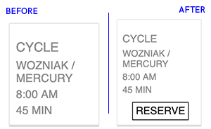
.scheduleTable .scheduleBlock span.reserve-link {
    display: block;
    visibility: visible;
}
.scheduleTable .scheduleBlock span.reserve-link::after {
    content: "RESERVE";
}
.scheduleTable .scheduleBlock span.reserve-link:hover {
    cursor: pointer;
}
Alternate my account menu
If you’d prefer to have a more visible and easily accessed ‘my account’ menu once a customer is logged in, paste this snippet in to display the full my account menu.
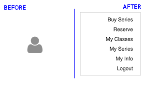
@media screen and (min-width: 768px) {
    #dashboard {
        padding-right: 22%;
    }
    .dropdown.my-account .dropdown-toggle {
        display: none !important;
    }
    .dropdown.my-account .dropdown-menu {
        display: block !important;
    }
    .dropdown.my-account ~ .page-content {
        padding-right: 22%;
    }
    .dropdown.my-account ~ .page-header {
        margin-right: 22%;
    }
}

@media screen and (max-width: 767px) {
    .dropdown.my-account .dropdown-toggle:focus,
    .dropdown.my-account .dropdown-toggle:active,
    .dropdown.my-account .dropdown-toggle:hover {
        text-decoration: none;
    }
    .dropdown.my-account .dropdown-toggle:before {
        content: "My Account  ";
        font-size: 14px;
        font-weight: 600;
    }
    .dropdown.my-account .dropdown-toggle .fa:before {
        content: "\f107";
        position: relative;
        top: 3px;
        margin-left: 3px;
    }
    .dropdown.my-account .dropdown-toggle .caret {
        display: none;
    }
}
Import a font with font-face
Have your sights set on a custom font? No worries; the zingfit platform supports custom fonts as long as you are to source them from an external URL.
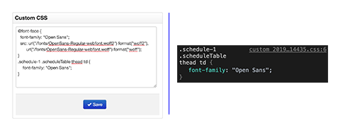
@font-face {
    font-family: CustomFont;
    src: url(custom-font.ttf);
}
Unhide location dropdown
If you’d like to be able to switch between locations on the schedule page; paste this snippet in to enable the location dropdown.
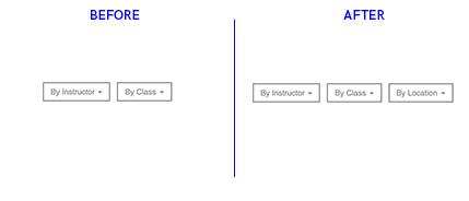
.hidden {
    display: block;
    visibility: visible;
}
Hide class duration
If you’d rather not display the class length on the schedule for a more clean and minimalist approach; paste this in to remove the class duration.
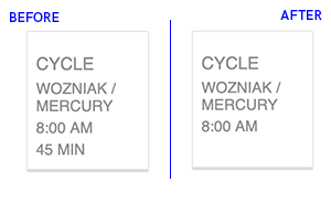
span.classlength {
    display: none;
}
Transparent background
If you’d like to hide the background color and utilize the background image/color on your hosting CMS; paste this in to make it transparent.
body, html{
    background-color:none;
    background:none;
}
Hide header
If you’d like to remove the header from your pages; paste this snippet in.
.zf-body h1, .zf-body h2 {
    display: none;
}
Highlight class
If you’d like to alter the coloration on your my series when a booking is successful, paste this in to make the change.
.zf-body .table tbody tr.success td {
    background: #656565;
    color: inherit;
}